This project is an extention of the the Typography Rules Poster to design a poster typographically conveying one of the Rules of Type listed below.
A poster/flyer is a poster-size print document that is folded in half, then folded in half again, creating four spatial panels on each both sides of the paper. One side constitutes a poster, the other side constitutes a flyer with a front and back cover and an inside spread, leading up to the presentation of the poster.
The objective of this project is to first, discover the typographic system that you created in your first Typographic Rules Poster. Then using that system design a second Rules Poster on one side of the print document, and a Flyer message introducing the poster, on the other side of the print document.
Just like the Typography Rules Poster, this project stresses the importance of message hierarchy, visual syntax and typopgraphic craft working together to create a visually expressive typographic message to a particular audience. This project however adds both the complexity and the expressive potential of four additional panel/pages leading up to the poster message.
The Typography Rules Poster side of the design needs to include:
• a Running Head, Typography Rules
• your Type Rule Number
• your Type Rule
• your Type Company Logo,
but without the
• the Rules of Typography Introductory Paragraph
This Flyer side of the design needs to include:
• the Title, Typography Rules
• the Rules of Typography Introductory Paragraph
• all 19 Typography Rules
• your Type Company Logo,
• and any other written and typographic elements you deem necessary for a successful message
The typographic system from which you will design your Rule poster/flyer is comprised of all of the design decisions that you made during the design of your first Typography Rules poster.
To launch this project you will need to analyze, determine and list the final grid and hierarchical consequences of your first Typography Rules Poster, including:
• grid and margin ratios
• fonts
• colors
• hierarchical size, location and position relationships of your message components
• other design consequences
The final poster/flyer will be printed two-sided 11" x 17" on the Epson printer in the digital lab.
Use may use color and transparency, but no images please, particularly monkeys.
Once again, be engaged with the message while you are designing it. Strive to use your eyes, your mind, and your bodily feelings in concert to make expressive and appropriate design decisions. _______________________________________
For this project individual students have been assigned the following second rules:
Sidney - Rule #1
Alyssa - Rule #2
Aubree - Rule #3
Baylee - Rule #4
Breana - Rule #5
Brendon - Rule #6
Bri - Rule #7
Delaney - Rule #8
Devin - Rule #9
Jane - Rule #10
Jeffrey - Rule #11
Jenyann - Rule #12
Jordan - Rule #13
Kayla - Rule #14
Kelsey - Rule #15
Kyler - Rule #16
Maddy - Rule #17
MJ - Rule #18
Sammi - Rule #19
_______________________________________
TYPOGRAPHY RULES
Over the centuries, typographic guidelines have been developed to provide consistency and competency within the profession, to preserve the beauty and legibility of typographic form, and to ensure that typography functions as often mandated: to clearly represent the thoughts of the author or the voice of the message. These rules are not absolute or definitive, but they are representatives of a sturdy, time-tested collection of typographic guidelines.
These rules provide a critical foundation for informed and responsible practice.
1 For optimum legibility, choose classical, time-tested typefaces with a proven track record.
2 Be mindful not use too many typefaces at any one time.
3 Avoid combining typefaces that are too similar in appearance.
4 Text set in all capital letters severely retards reading. Use upper- and lower-case letters for optimum readability.
5 For text type, use sizes that according to legibility studies prove most readable.
6 Avoid using too many different type sizes and weights at the same time.
7 Use text types of book weight. Avoid typefaces appearing too heavy or too light.
8 Use typefaces of medium width. Avoid typefaces that appear extremely wide or narrow in width.
9 For text type, use consistent letter and word spacing to produce an even, uninterrupted texture.
10 Use appropriate line lengths. Lines that are too short or too long disrupt the reading process.
11 For text type, use line spacing that easily carries the eye from one line to the next.
12 For optimum readability, use a flush left, ragged right type alignment.
13 Strive for consistent rhythmic rags.
14 Clearly indicate paragraphs, but be careful not to upset the integrity and visual consistency of the text.
15 A typographic widow or orphan is a word sitting by itself on a line at the end of a sentence or a paragraph, or at the top of the first column of a new page. Avoid widows and orphans whenever possible.
16 Emphasize elements within text with discretion and without disturbing the flow of reading.
17 Always maintain the integrity of type. Avoid arbitrarily stretching letters.
18 Always align letters and words on the baseline.
19 When working with type and color, ensure that sufficient contrast exists between type
and its background.
______________________________________________________
Project Schedule
• Rules Poster side design due Tuesday, March 19th. Please have the design printed out by the beginning of class.
• Complete Rules Poster/Flyer design due Thursday, March 21st. Please have the design printed out by the beginning of class.
• Complete Rules Poster/Flyer design due Thursday, March 21st. Please have the design printed out by the beginning of class.
• Final Project due printed by the end of class Tuesday, March 26th.
It must include:
• The first Type Rules Poster re-laid out to an 11x17“ size and printed out.
• The second Type Rules Poster laid out to match typographic system of the the first poster and printed out 11x17" size.
Part of your final grade will be based upon how well the two posters work within the typographic system.
• The final design of the Flyer side of Poster/Flyer laid out using typographic system of the posters, then printed out on the back side of one of the printed Type Rules Poster of your choice.
Remember that the position and alignment of the pages on the Flyer side of the Poster/Flyer is critical for proper viewing of the message when turning the pages and unfolding the final publication.
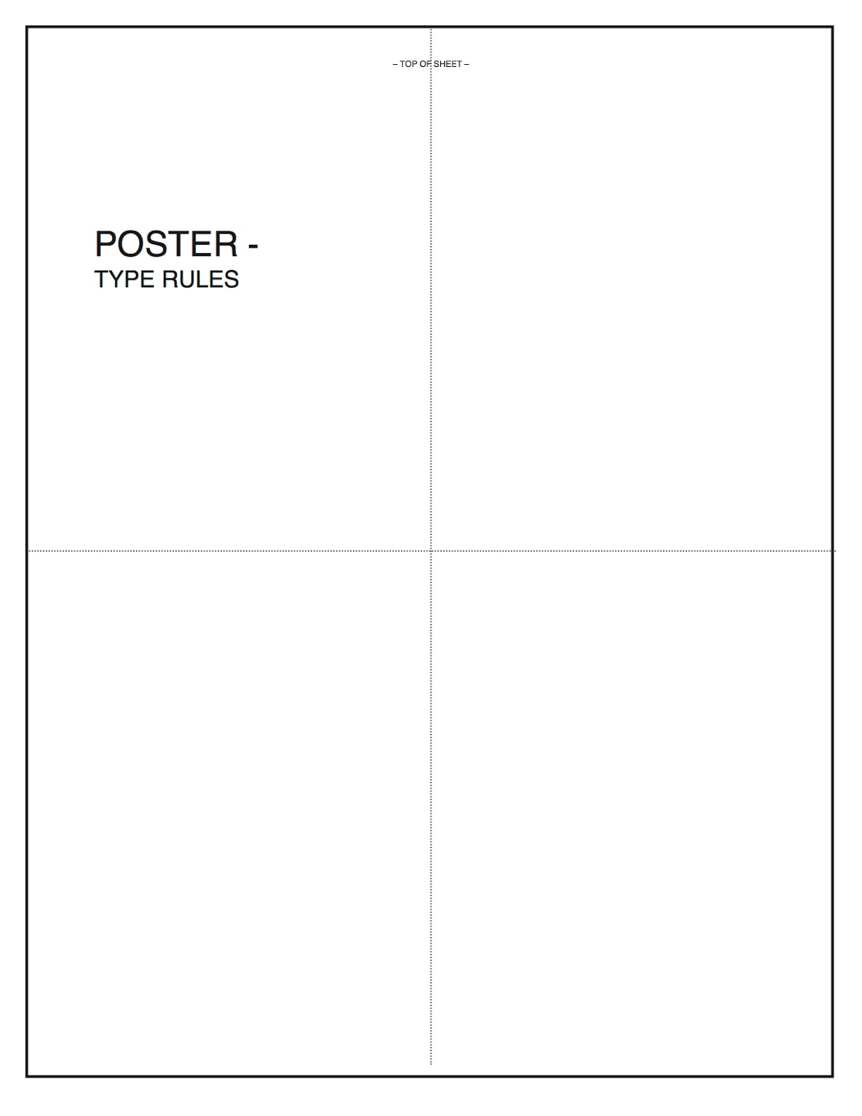

Use your 11x17 paper dummy for reference to properly layout your Flyer. Both sides of the Poster/Flyer should look like the diagram above in relationship to one another when you are ready to print. Note the position and orientation of the covers, as well as the spread to the folds, as well as the top of the 11x17 sheet. I suggest you output your final design as two CYMK PDF files. You may print them in the DOVAD Digital Lab, the Copy Center in the Union Building, or at FedEx.
One you have printed the Poster/Flyer, front and back on the same sheet, carefully fold it in half horizontally, then vertically, so that it reads correctly.
Part of your final grade will be based upon how well the flyer reads as you turn the pages and open the poster.
Hang up both the final Rules Poster, and your final Poster/Flyer in the hallway, no later than the end of class, Tuesday, March 26th.
______________________________________________________
Here are some examples of print collateral designed using a typographic system.


